
PROJECT
UX/UI Design
CLIENT
Lingo
DATE
2018
Lingo
Lingo
This project had two different challenges:
1 – Create a new corporate website, highlighting their teaching methodology, pricing policy, 24/7 availability, and tools to help B2B clients manage their employees;
2 – Build the learning platform from scratch: a new system where students can manage their accounts, their billing history, and schedule new classes. A responsive system, for both desktop and mobile devices, and an exclusive iOS and Android app for students and teachers.
Growth. Our purpose is to allow Lingo to grow. This is how we did it.
User Research
Lingo works with students (and teachers) from all over the world. For the first version of the platform, our approach was to focus on understanding and improving the experience for Brazilian students. We conducted a quantitative research, with over 35 students of foreign languages. Our goal was to discover how other schools allows students to manage their schedule, make/cancel scheduled classes, and what are the most critical pain points.
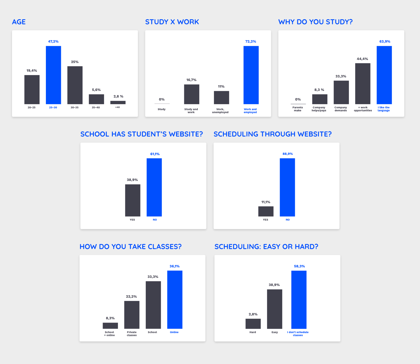
Top critical pain points we could identify and work to improve the experience for the students:
- Hard to check classes availability
- Cancel class: boring and takes too long
- Confirmation takes too long
- Scheduling through Whatsapp: unprofessional
- School contacts students to reschedule classes
Product Requirements
I attended the product requirements gathering meetings, along with the Project Manager. In the course of 8 meetings, we talked about some required features and created some hypothesis working side by side.
Combining the research, product requirements and a benchmarking analysis, these were the key points we had to cover designing the platform:
- Easy to use schedule
- Automatic cancellation process
- Automatic scheduling confirmation
- Show and notify students when their next scheduled class is going to happen, so they don’t miss it
User Interface Design
Corporate website interface
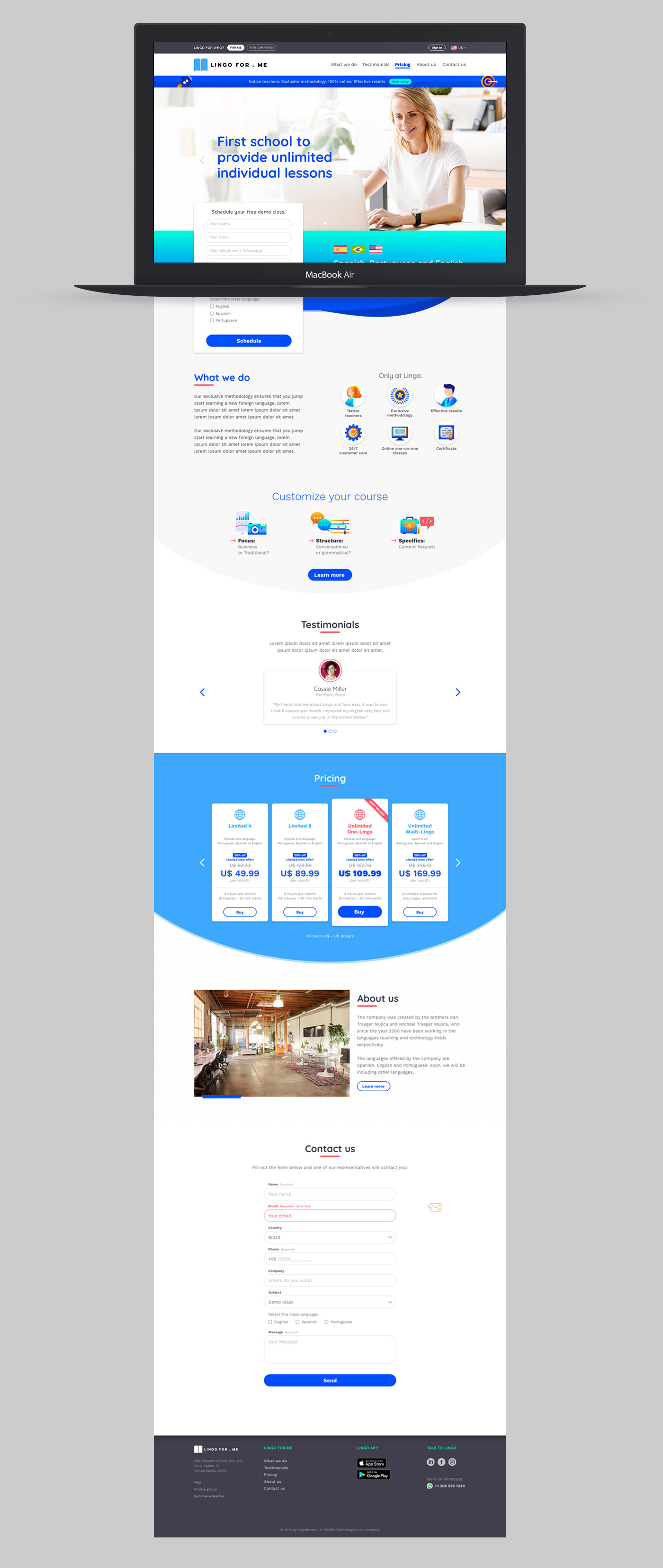
Responsive corporate website – has a B2B version

Plataform interface
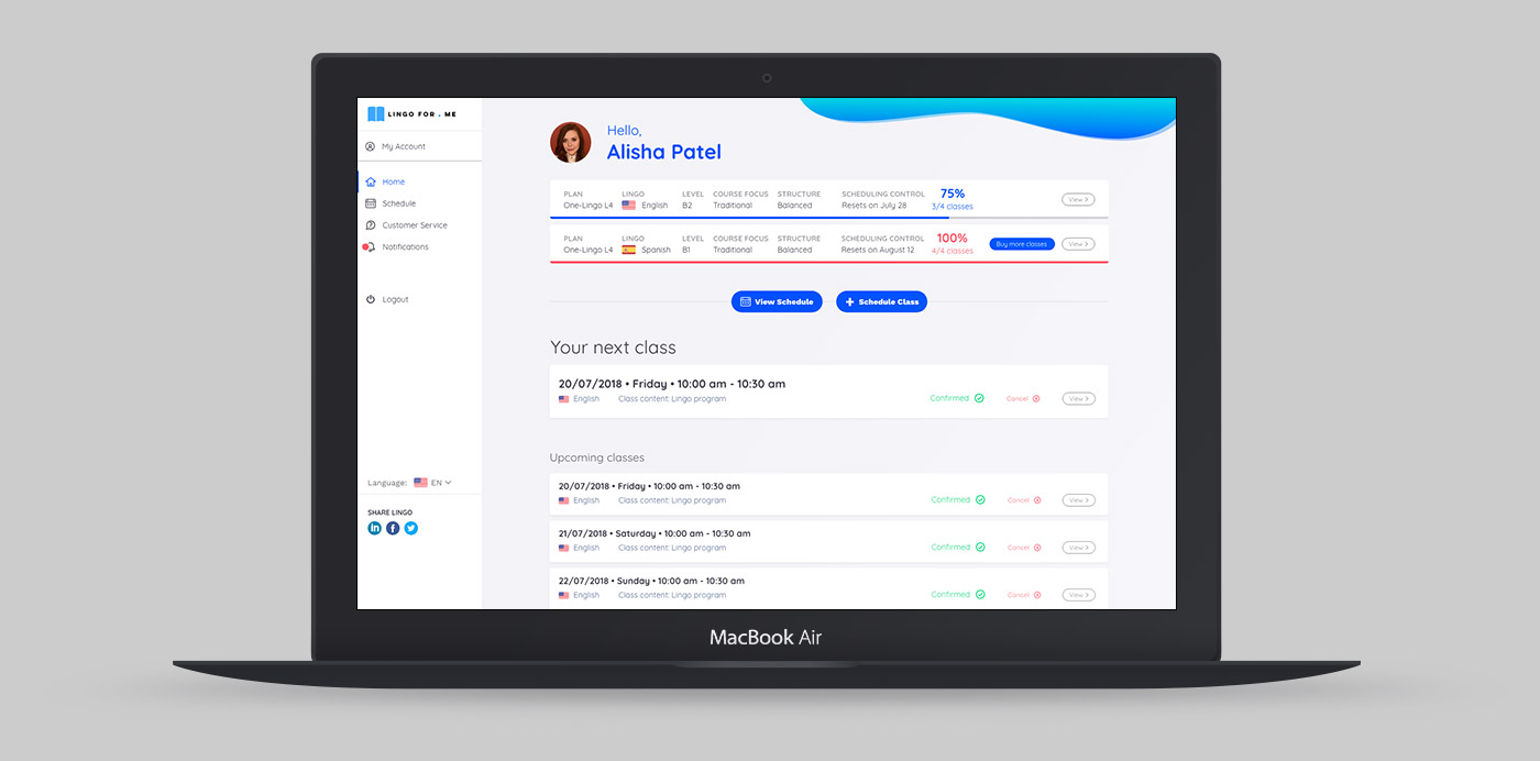
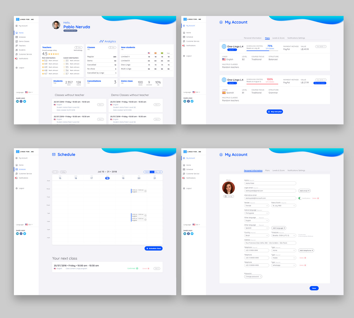
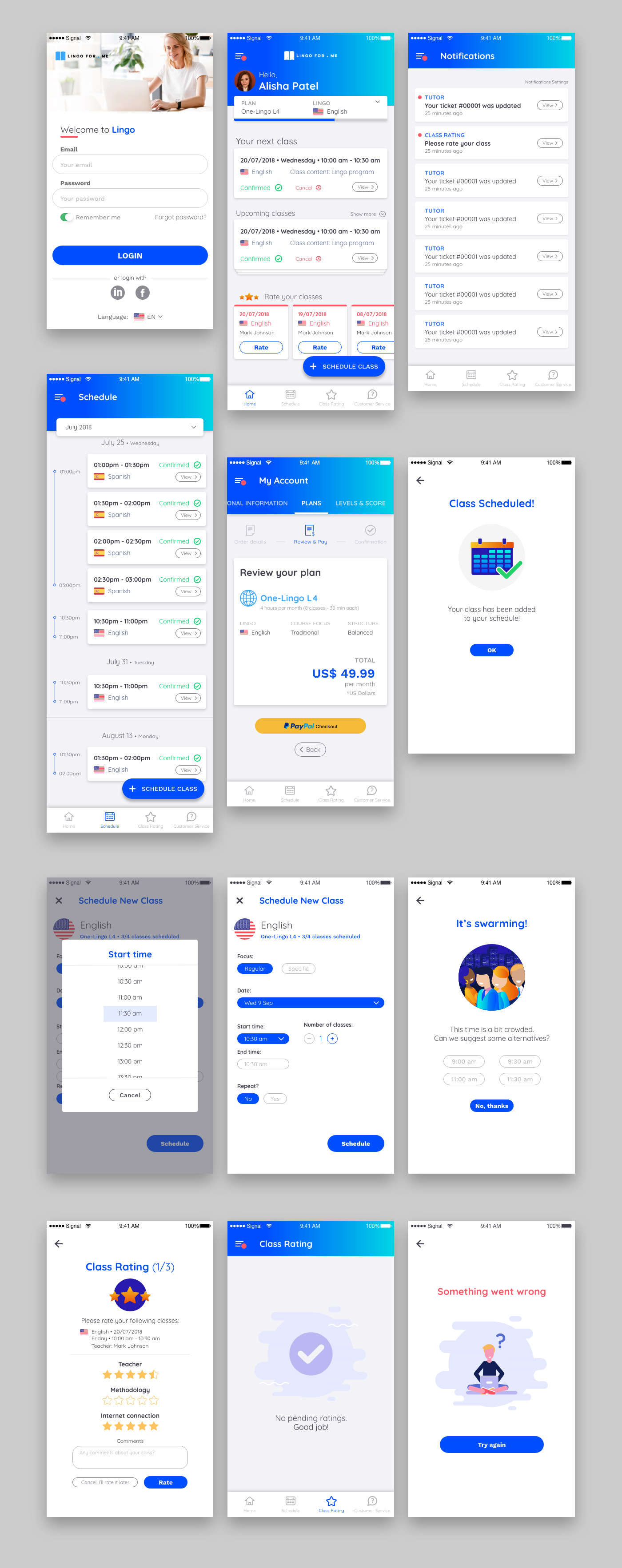
App interface
Interface animations prototypes
Menu (hit Play)
Lingo
Scheduling (hit Play)
