PROJECT
UX/UI Design
CLIENT
Brenv
DATE
2017
Brenv
Working in an agency environment, this was our first project using a true UX methodology in the Discovery and Research phase of the project. On the first day, the Head of Planning and I discussed for several hours about some hypothesis we had, based on what we knew about the client, their business, their competitors, and what we would like to achieve.
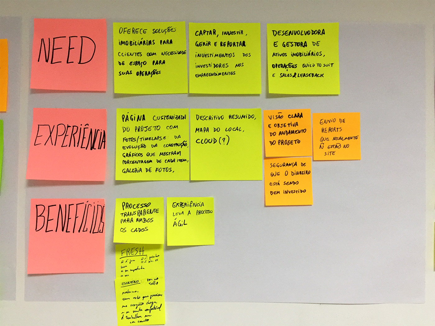
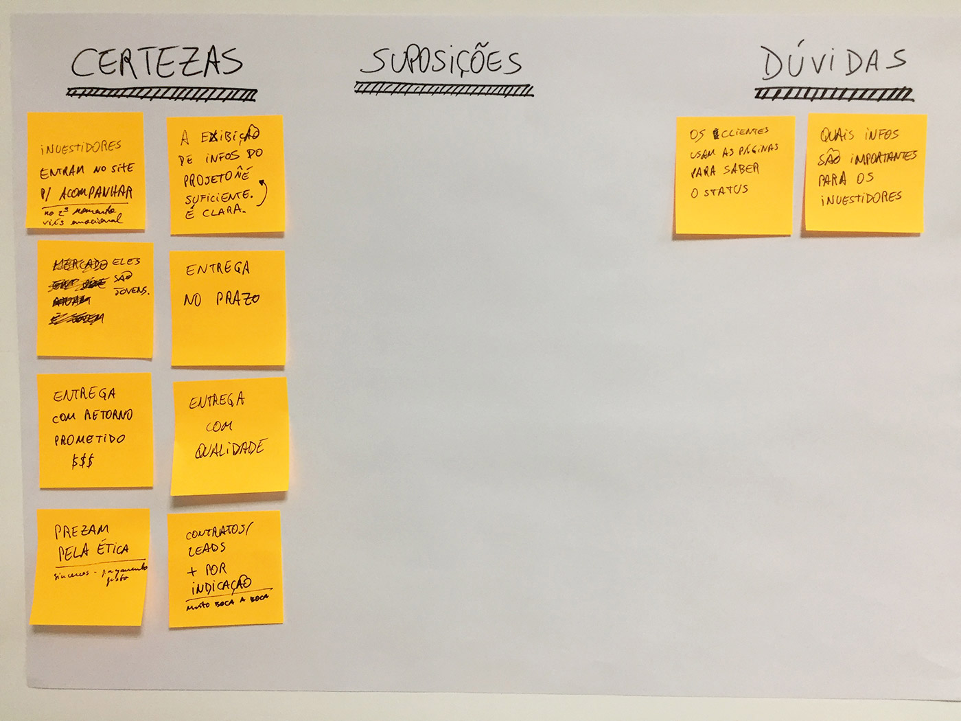
After our initial talk, we built a CSD matrix, to make sure we really knew what we were talking about. We decided not to proceed until we had plenty sticky notes under Certainty and as few as possible under Doubts.
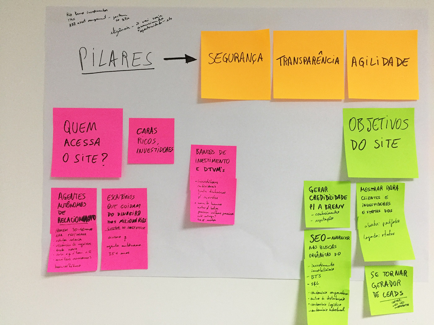
Next step was to understand Who was going to use the website. Based on the client’s pillars and goals, we began to sort these people out and identify some Personas.
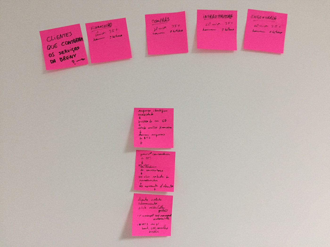
Now, what are the greatest pain points for the customers? What are they afraid of when they look for a company like Brenv, to manage or build real estate for them?
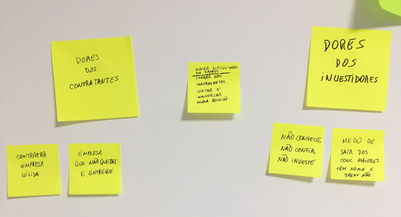
Time for a checkpoint.
We know Who we need to talk to, How to talk to them, and What they need to know when they visit the website. So it’s time to start figuring out Where this would take place in the website. We did it building a sticky note Sitemap: we put down in a sticky note some piece of content we needed to use, and then where we would place it. This sitemap has changed a few times before it was finished.
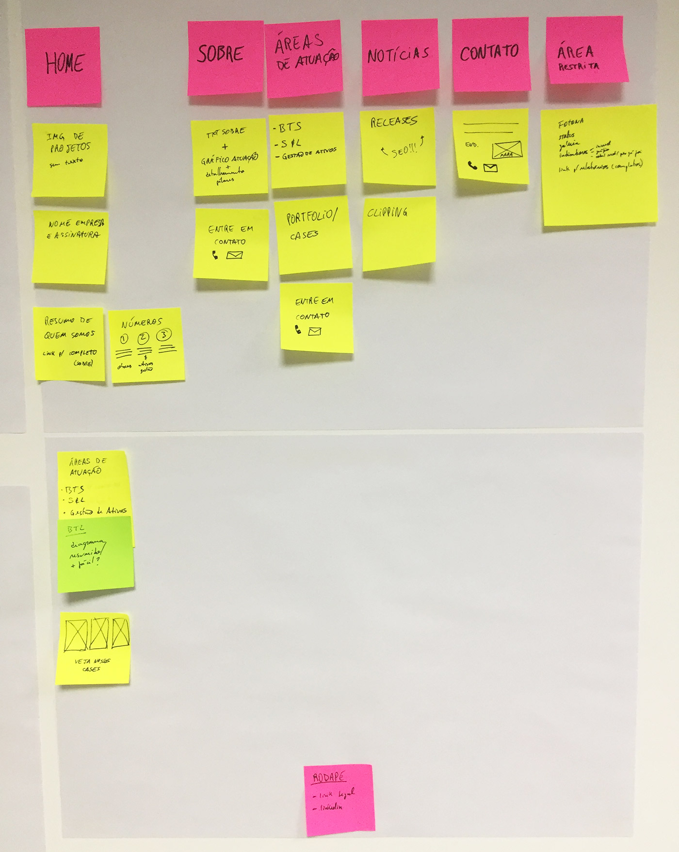
Ok, now it’s time to turn on the computer.
Once we covered these steps, I built the wireframe and wireflow for the entire website.
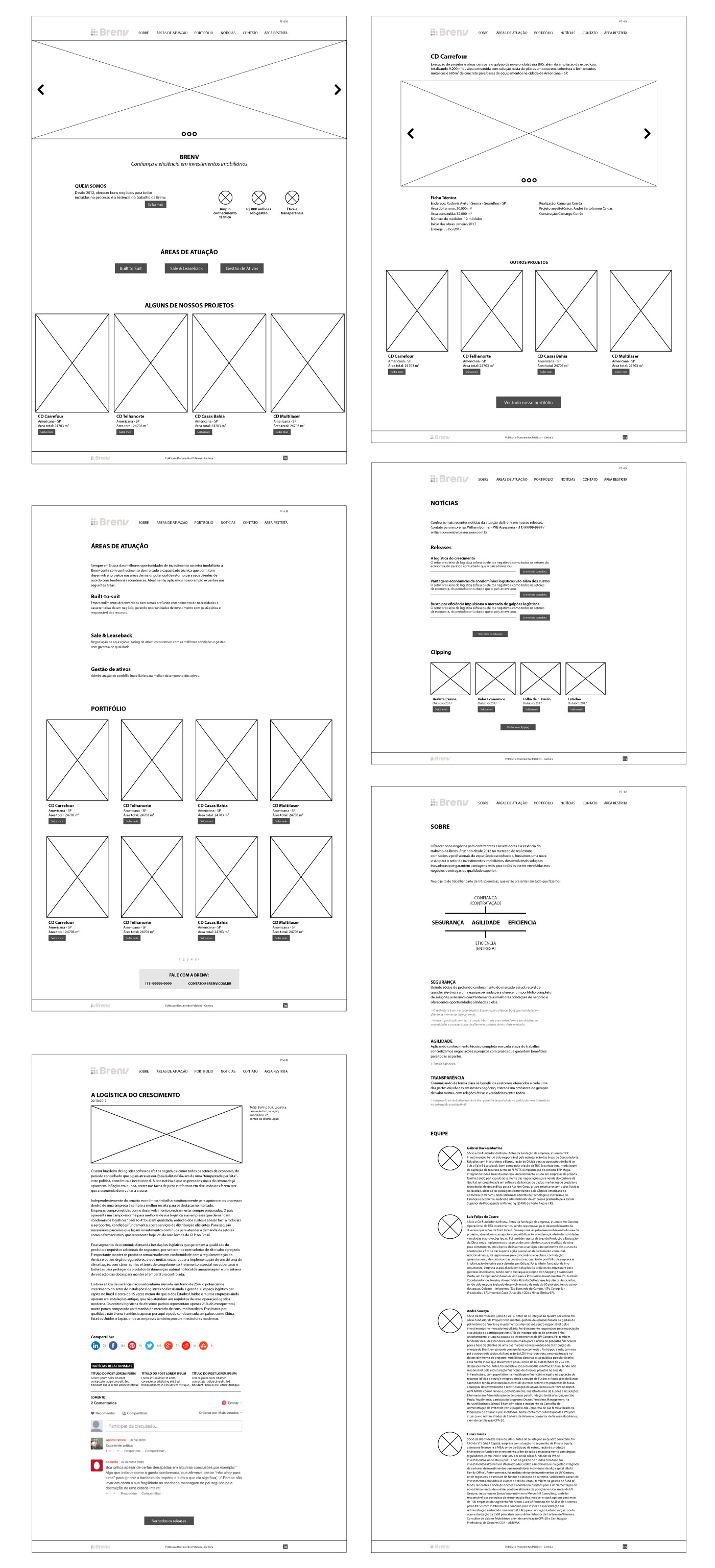
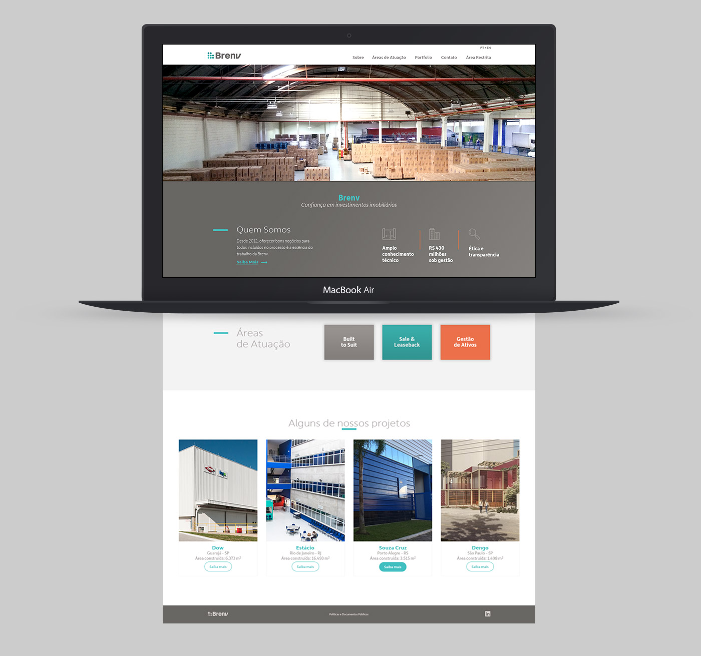
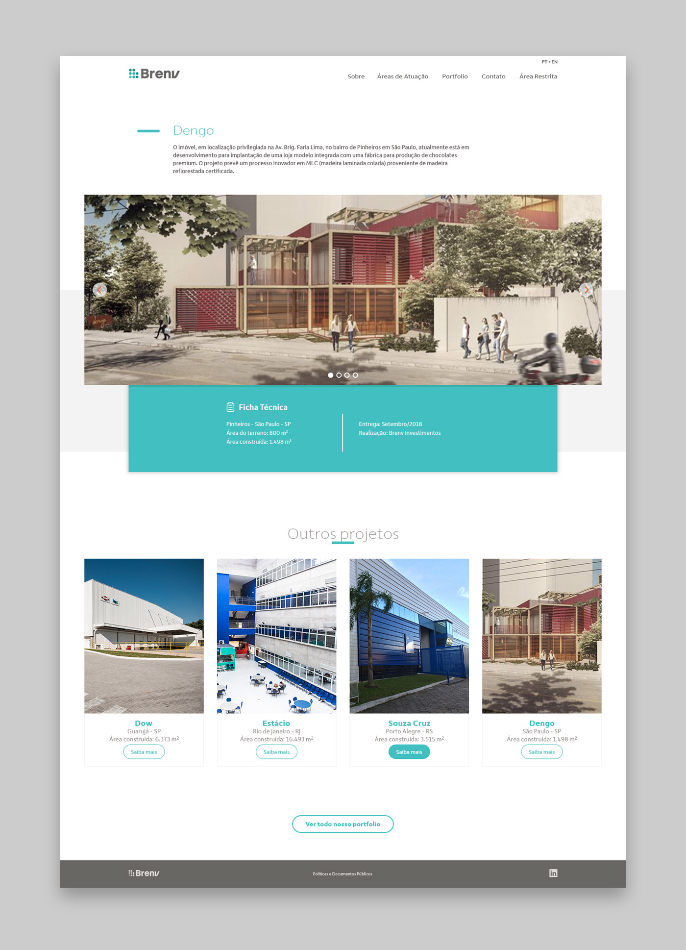
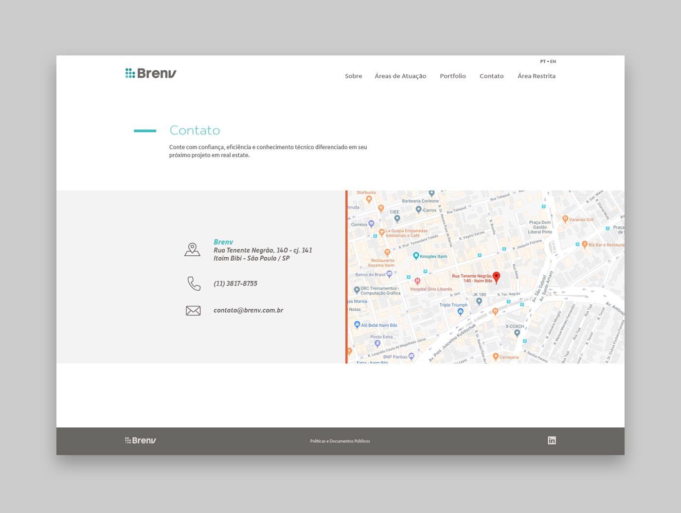
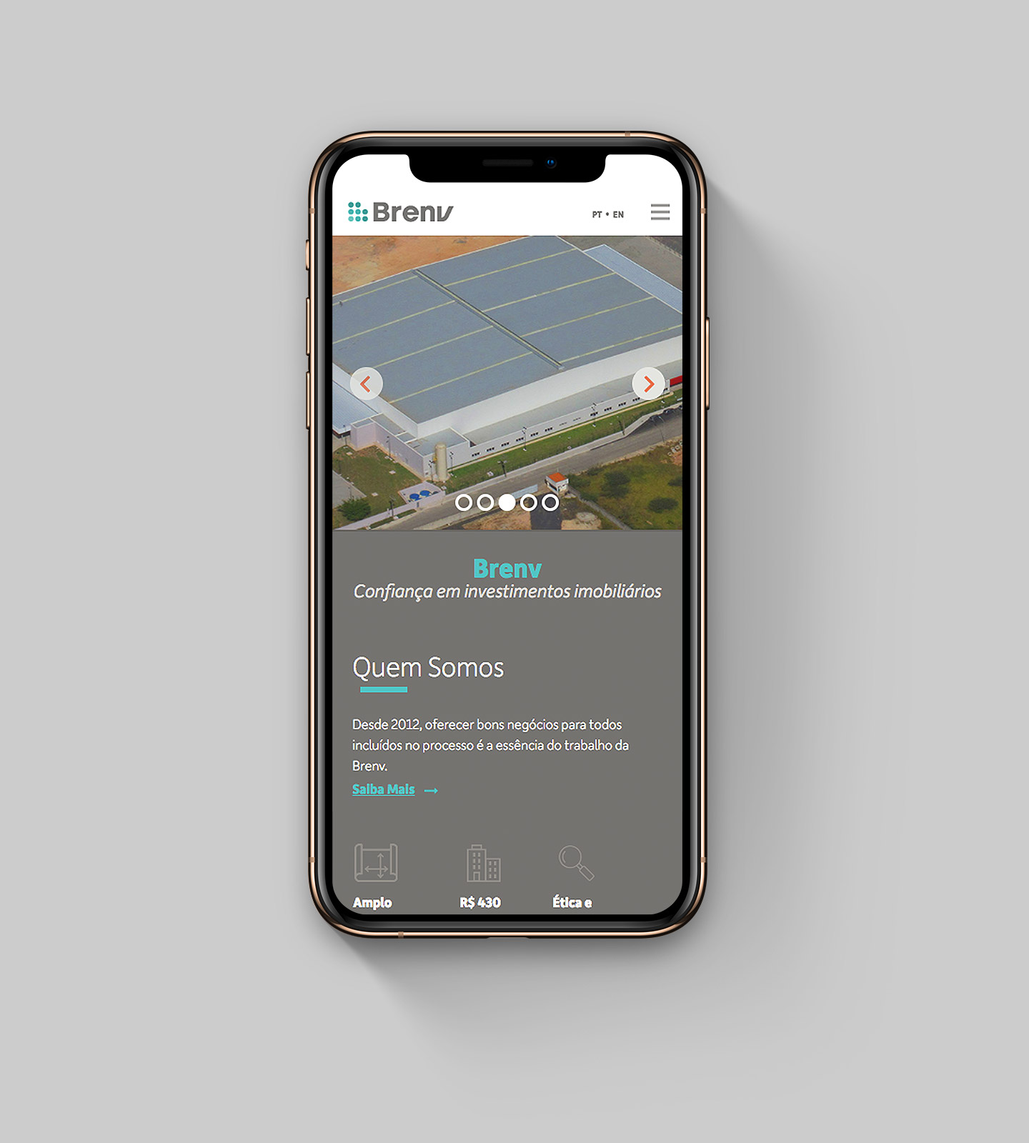
Finally, time to design the interfaces (12 col. grid, responsive), export the assets and ensure a smooth handoff to the developer.
